Please stop shouting... I can't hear

Passenger transport industry design specialist Ray Stenning continues his regular look at how the style and presentation of the product can make a massive difference to its appeal.

Ray Stenning
27 October 2011
Ray Stenning  is Design Director of his company Best Impressions which specialises in providing creative services to the passenger transport industry. He has worked for over 30 years on everything from rail and bus liveries and vehicle styling to timetables and publicity and corporate identity
ray@best-impressions.co.uk
Ray Stenning is Design Director of his company Best Impressions which specialises in providing creative services to the passenger transport industry. He has worked for over 30 years on everything from rail and bus liveries and vehicle styling to timetables and publicity and corporate identity ray@best-impressions.co.uk
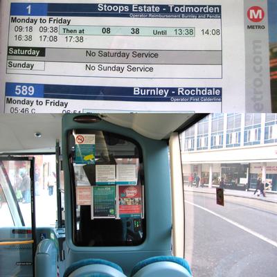
2.  Too many messages, a poor use of language and a competition for attention. What does this achieve, and say about the organisation?
2. Too many messages, a poor use of language and a competition for attention. What does this achieve, and say about the organisation?
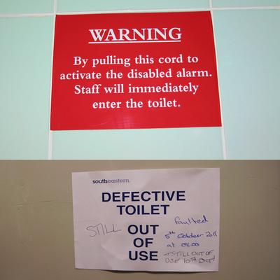
3.  An inconvenient outcome. These signs are asking for ridicule, neither helping customers with their message or making the company seem competent
3. An inconvenient outcome. These signs are asking for ridicule, neither helping customers with their message or making the company seem competent
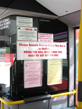
1.  A lack of clarity means the message is lost, whether in a timetable, or on a window plastered with a mess of notices, uninviting and often unreadable.
1. A lack of clarity means the message is lost, whether in a timetable, or on a window plastered with a mess of notices, uninviting and often unreadable.
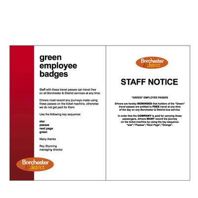
4.  These two images show different ways of communicating. One notice is badly designed and phrased with the emphasis on how the company needs the money, as if the staff are nothing to do with the business. The other offers a more attactive solution, well designed with the emphasis on what the notice is for, and involving the staff as part of the company.
4. These two images show different ways of communicating. One notice is badly designed and phrased with the emphasis on how the company needs the money, as if the staff are nothing to do with the business. The other offers a more attactive solution, well designed with the emphasis on what the notice is for, and involving the staff as part of the company.


E­veryone knows - or should know - that it’s not just what you say, it’s how you say it that counts. Just as this applies to speech, it applies to notices. Ah, notices; those lovely bits of communication that are peppered across public transport vehicles and terminii, and which all too often through their phrasing, syntax, vocabulary and lack of design can communicate hidden messages far more toxic than those the originators intended. And why is it that such notices are so often...

+91% more


Transport Services Manager
Rutland County Council
Rutland
£54,976 - £58,977
Transport Services Manager
Rutland County Council
Rutland
£54,976 - £58,977
Transport Services Manager
Rutland County Council
Rutland
£54,976 - £58,977
View all Vacancies
 
Search
 
 
  • Sorry, there are no results
 

TransportXtra is part of Landor LINKS

© 2024 TransportXtra | Landor LINKS Ltd | All Rights Reserved

Subscriptions, Magazines & Online Access Enquires
[Frequently Asked Questions]
Email: subs.ltt@landor.co.uk | Tel: +44 (0) 20 7091 7959

Shop & Accounts Enquires
Email: accounts@landor.co.uk | Tel: +44 (0) 20 7091 7855

Advertising Sales & Recruitment Enquires
Email: daniel@landor.co.uk | Tel: +44 (0) 20 7091 7861

Events & Conference Enquires
Email: conferences@landor.co.uk | Tel: +44 (0) 20 7091 7865

Press Releases & Editorial Enquires
Email: info@transportxtra.com | Tel: +44 (0) 20 7091 7875

Privacy Policy | Terms and Conditions | Advertise

Web design london by Brainiac Media 2020